The Calibri Controversy: How the US Government's Switch Shook Trust in A Beloved Font
Created: 2023.07.21
In a twist that nobody saw coming, the decision by the US Government earlier this year to transition from the traditional Times New Roman to the sleeker Calibri has sparked a tumultuous cascade of events. The most dramatic of these is a major shake-up by tech giant Microsoft, who announced the replacement of Calibri as the default font with a new font, Aptos.
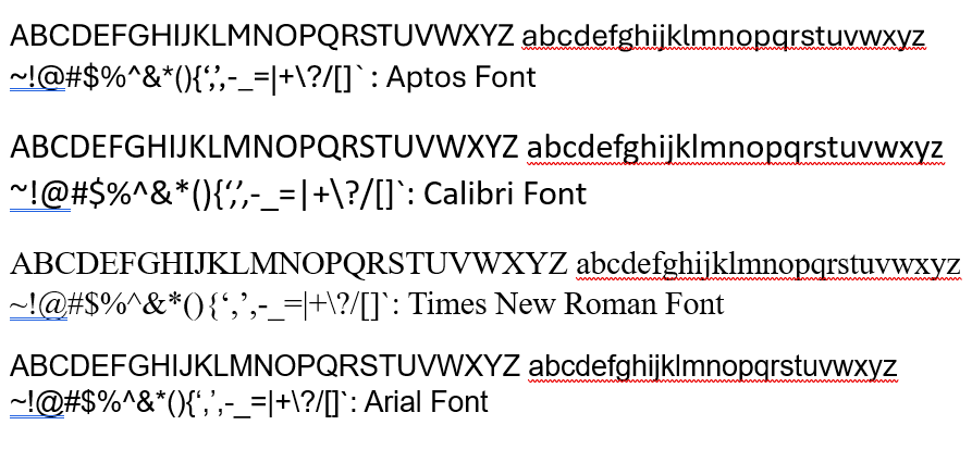
Calibri, the long-standing default font of Microsoft Office since 2007, enjoyed a comfortable reign across countless documents, from school assignments to business reports, until it was disrupted by the US Government's surprise adoption. Given the federal government's reputation for bureaucratic formality, this marked a significant departure from tradition and raised many eyebrows.
The timing, it seems, could not have been worse for Calibri. The adoption by the US Government, for some, pushed Calibri from a modern, neutral choice to one suddenly loaded with connotations of officialdom and governmental paperwork. The ubiquity that once made Calibri a universal and unobtrusive presence quickly became a liability, as the font's new governmental affiliation led to an unintended rebranding. What was once the beloved default became a source of skepticism and controversy.
The question of why this move would stir such a reaction can be understood by considering the psychology of fonts. Fonts, like color schemes and layouts, play a crucial role in how information is perceived. A change in a font can significantly impact the reader's impression of a document, potentially affecting its readability and the reader's mood. In the case of Calibri, its adoption by the government seemingly transformed it from a standard, versatile typeface to a more bureaucratic and institutional one.
Microsoft's decision to change its default font to Aptos, announced shortly after the US Government's transition, is therefore intriguing. Whether this change was prompted by the government's adoption of Calibri, or it was a decision made independently of external influence, remains a topic of speculation. However, it is clear that the decision has further underscored the controversy around Calibri.
Aptos, the successor of Calibri, presents itself as an attractive alternative. It is touted for its adaptability, readability, and modernity, offering a fresh start after the recent controversy. Only time will tell how this change will be received by Microsoft users and whether it will enjoy the same ubiquitous appeal as Calibri once did.
In this whirlwind of events, one thing is clear: the impact of fonts on our day-to-day lives is far greater than we often realize. The Calibri controversy serves as a reminder that fonts, much like words themselves, carry weight and can influence perception in subtle, yet powerful ways.